Choosing the right colours for an apartment goes far beyond aesthetics. A well-designed colour palette can completely transform how a property feels, making rooms appear more spacious, bright and welcoming.
In an apartment intended for holiday or mid-term rentals, colour also plays an important role in a guest’s first impression. A visually balanced property creates a sense of comfort, care and quality, while also helping photos stand out on booking platforms.
1. Opt for light colours
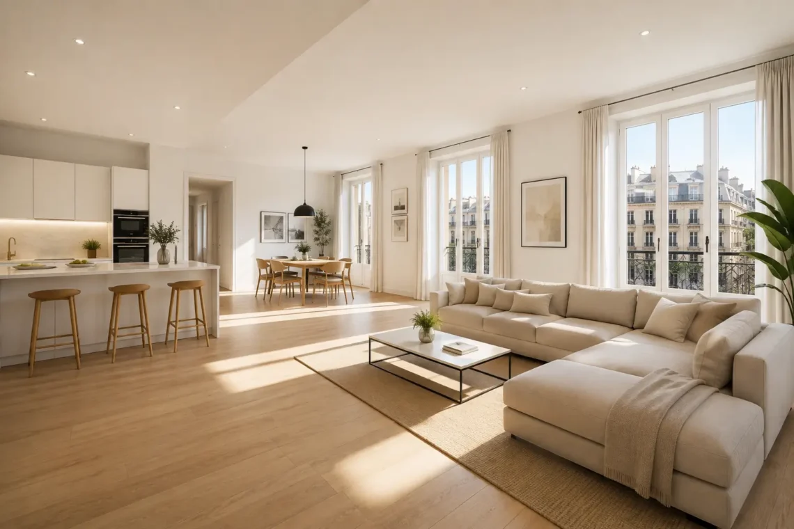
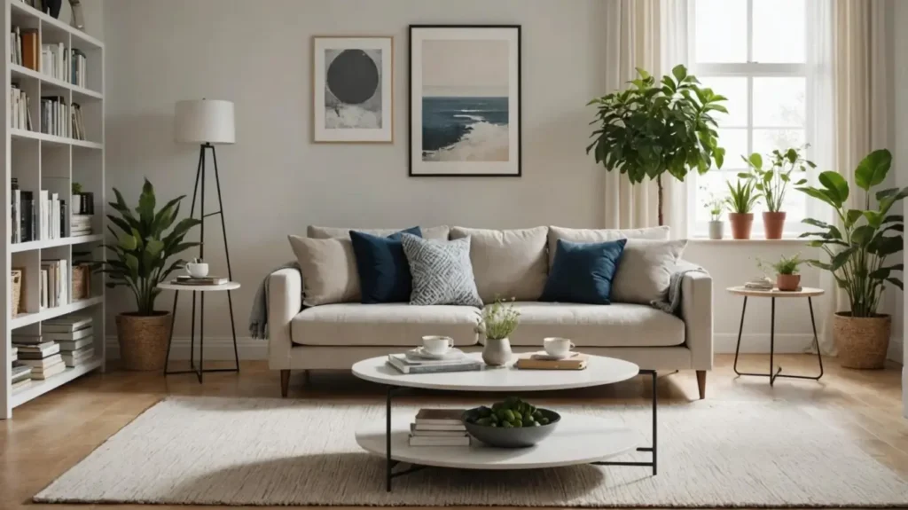
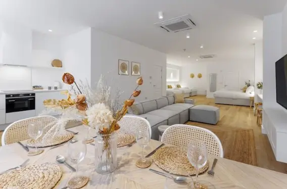
If you want to make an apartment feel more spacious, light shades are one of the most effective options. Colours such as warm white, beige, sand, soft grey and stone tones help reflect light and prevent rooms from feeling enclosed or overly busy.
This is particularly important in small apartments or properties with limited natural light, where the wrong colour choices can make a space feel even smaller.
The key is to choose a neutral base that brightens the space and combine it with different textures and materials. For example, an off-white wall can feel much warmer when paired with natural wood, earthy-toned textiles or decorative details that add subtle contrast.
What’s more, neutral shades offer another important advantage for property owners: they are more timeless. A décor scheme based on balanced colours can appeal to a wide range of guests.
2. Make the most of natural light
Natural light is one of the biggest factors affecting how we perceive colours inside a property. The same shade can look completely different depending on the orientation of the apartment, the size of the windows and the amount of daylight the space receives throughout the day.
In apartments with limited natural light, soft, warm colours can help create a more inviting atmosphere. Shades such as cream, light beige and warm white reflect light more effectively and make the space feel cosier and more welcoming.
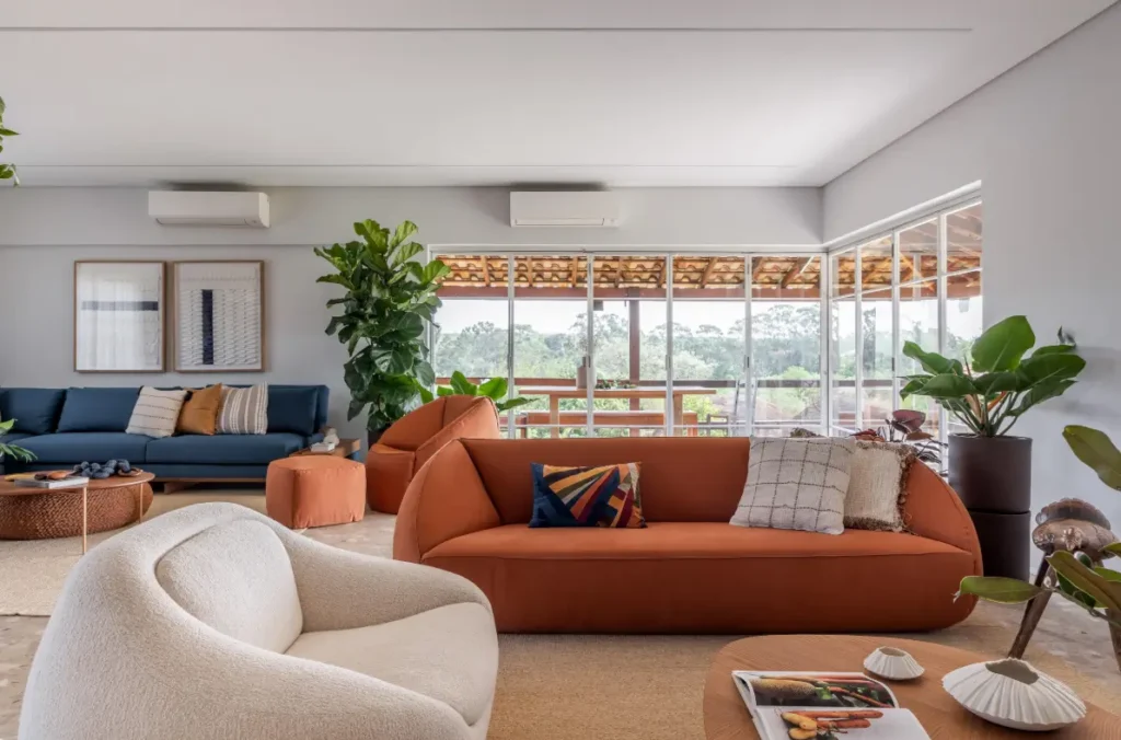
In properties with large windows, soft greens, pale blues and terracotta tones can add personality while maintaining a balanced, harmonious feel.
3. Add personality with colour
One of the most common decorating mistakes when styling an apartment is using too many different colours. An excessive mix of shades can create a sense of visual clutter and make the space feel smaller.
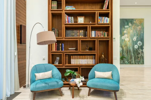
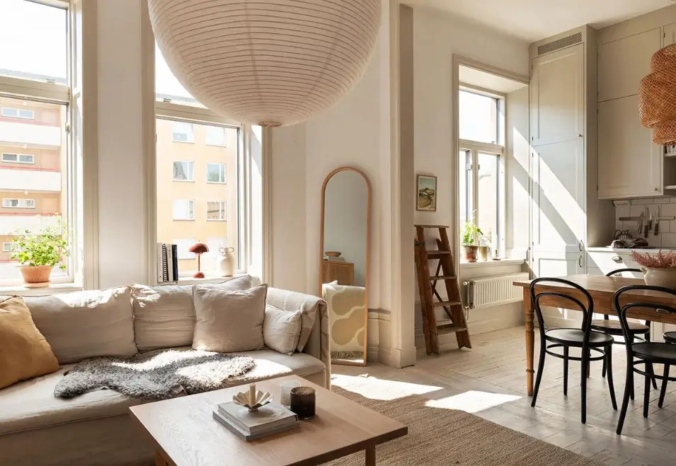
A more effective approach is to work with a main colour palette made up of two or three base shades, then add personality through decorative elements.
For example:
- Natural green through plants or textiles.
- Soft blue to add a fresh feel.
- Earthy tones to create a warm and comfortable atmosphere.
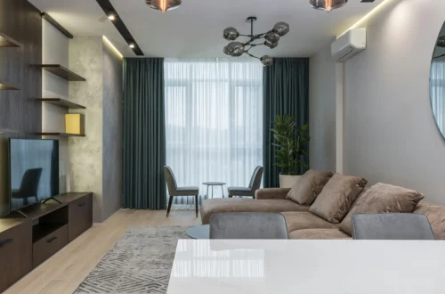
- Black or dark grey in small details to add a touch of elegance.
This approach makes it easy to refresh the look of an apartment without having to make major changes.
4. Create visual continuity
A sense of spaciousness doesn’t just depend on the actual size of an apartment, but also on how its different spaces connect visually.
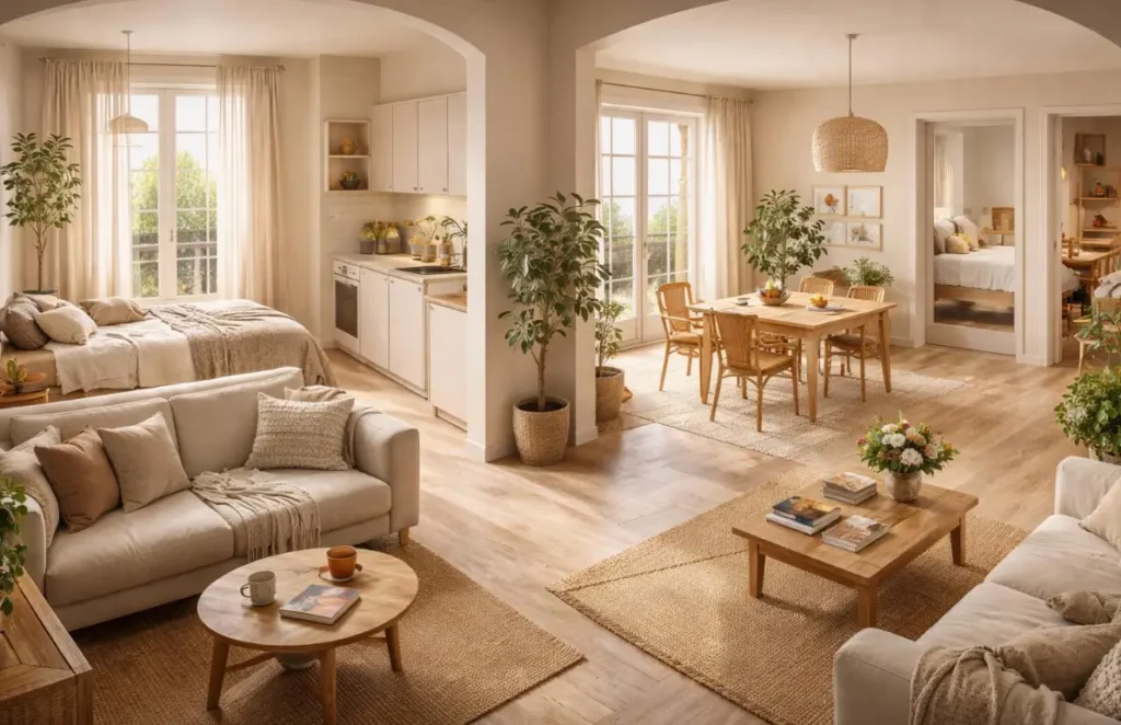
Maintaining colour continuity helps create a more seamless flow throughout the apartment and prevents the space from feeling overly divided.
For example:
- A living room with beige tones and natural wood can flow seamlessly into a bedroom decorated with white tones and natural textiles.
- A kitchen with neutral finishes can blend more naturally with the rest of the apartment.
- A bathroom decorated in light colours can enhance the feeling of cleanliness and spaciousness.
This consistency also works well in apartment photography, creating a more polished and professional look.
5. Think about the photos
In a competitive market such as holiday and mid-term rentals, photos are one of the first things that influence a guest’s booking decision.
Bright spaces, balanced tones and a consistent décor scheme create a stronger sense of cleanliness, comfort and well-being.
By contrast, overly dark colours, bold colour combinations or a lack of visual harmony can make an apartment look smaller or less appealing.
A well-planned colour scheme can help highlight important features, such as the size of the living room, the natural light in the bedrooms or the quality of the finishes.
Conclusion
Choosing the right colour palette is one of the simplest ways to improve the look of an apartment and how the space is perceived.
For property owners, opting for a neutral, timeless base is a smart investment: it improves the guest experience, makes the apartment easier to market and helps maintain an attractive look for longer.
Colours do more than simply decorate a property; they help shape that all-important first impression and can make the difference between an apartment that simply looks good and one that creates a memorable feeling from the moment guests see it.
If you found this useful, take a look at our Property Owners’ Blog to read more. And if you’re a property owner looking for advice from our team, don’t hesitate to get in touch with us!